Sonora Resturant Logo
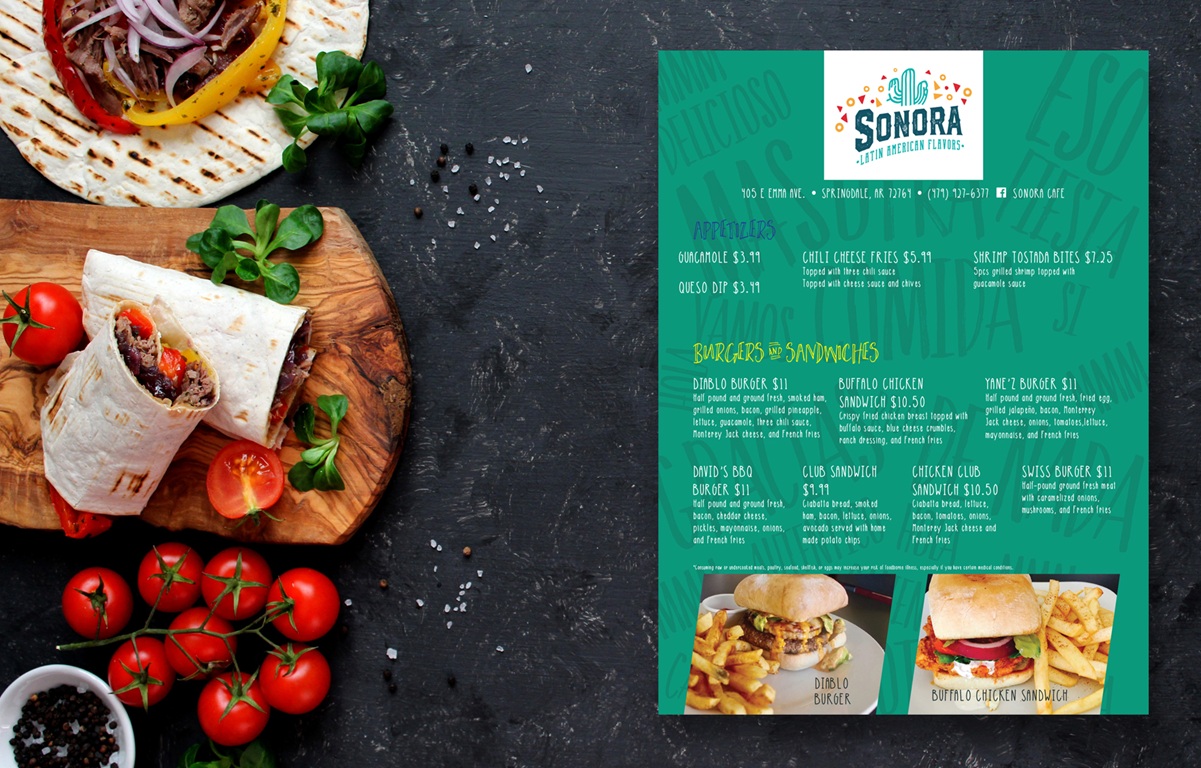
The Sonora brand identity was built to feel bold, vibrant, and unmistakably Latin. The logo pairs a stylized cactus with fiesta-inspired shapes to reflect a warm, festive energy rooted in tradition. Typography balances handcrafted personality with readability, giving the name strength without losing charm. The menu expands on the brand by using background language elements as visual texture. Spanish words like “comida,” “fiesta,” and “delicioso” are layered in oversized, low-opacity type to create depth and motion behind the food listings. A bright palette and playful headings keep the layout feeling casual and inviting, while strong structure ensures clarity. The result is a dining experience that feels flavorful from the first glance.